2024-2025
BRAND IDENTITY | MARKETING CAMPAIGNS & COLLATERAL | WEB & DIGITAL EXPERIENCES | PRINT PRODUCTION
Seismic
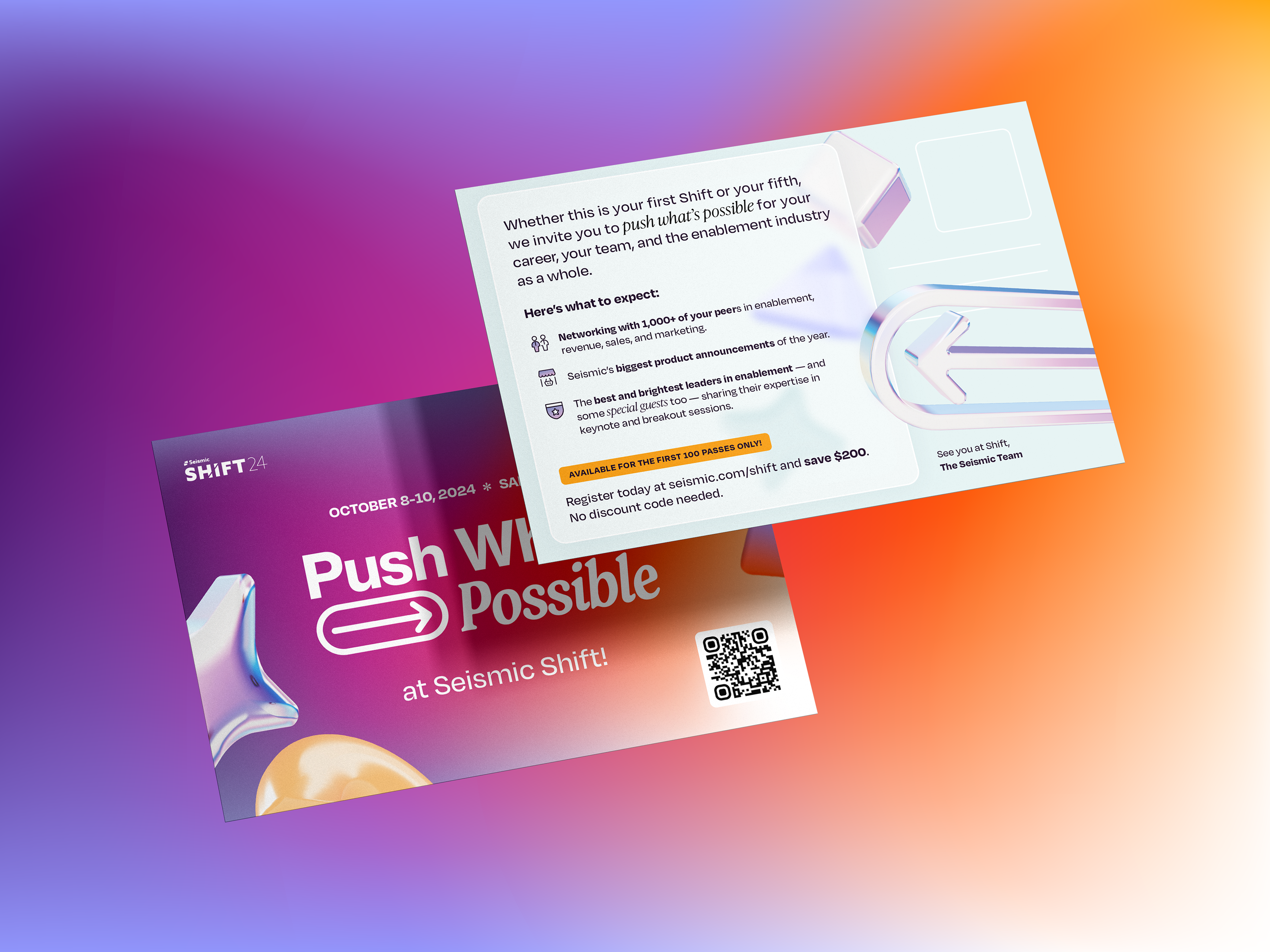
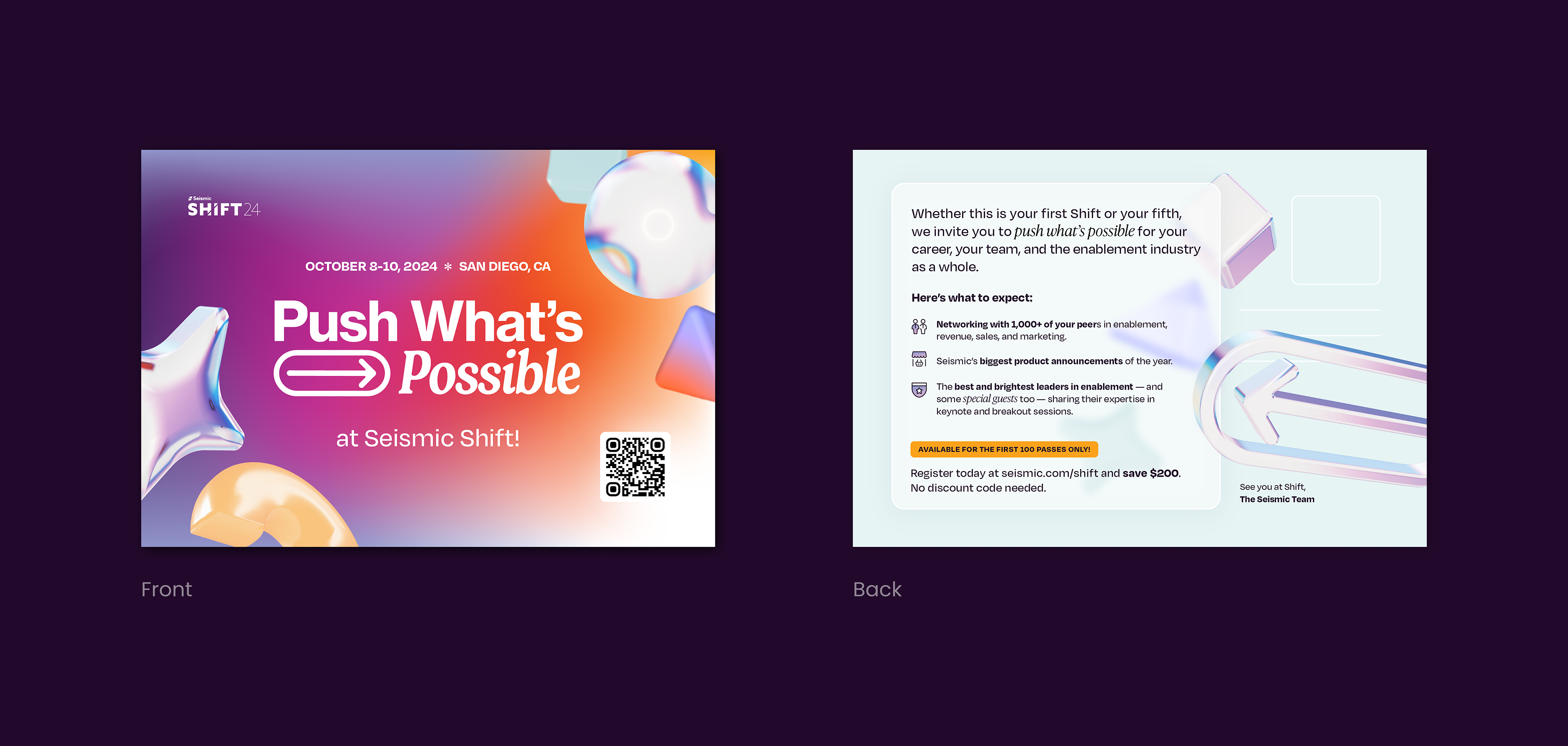
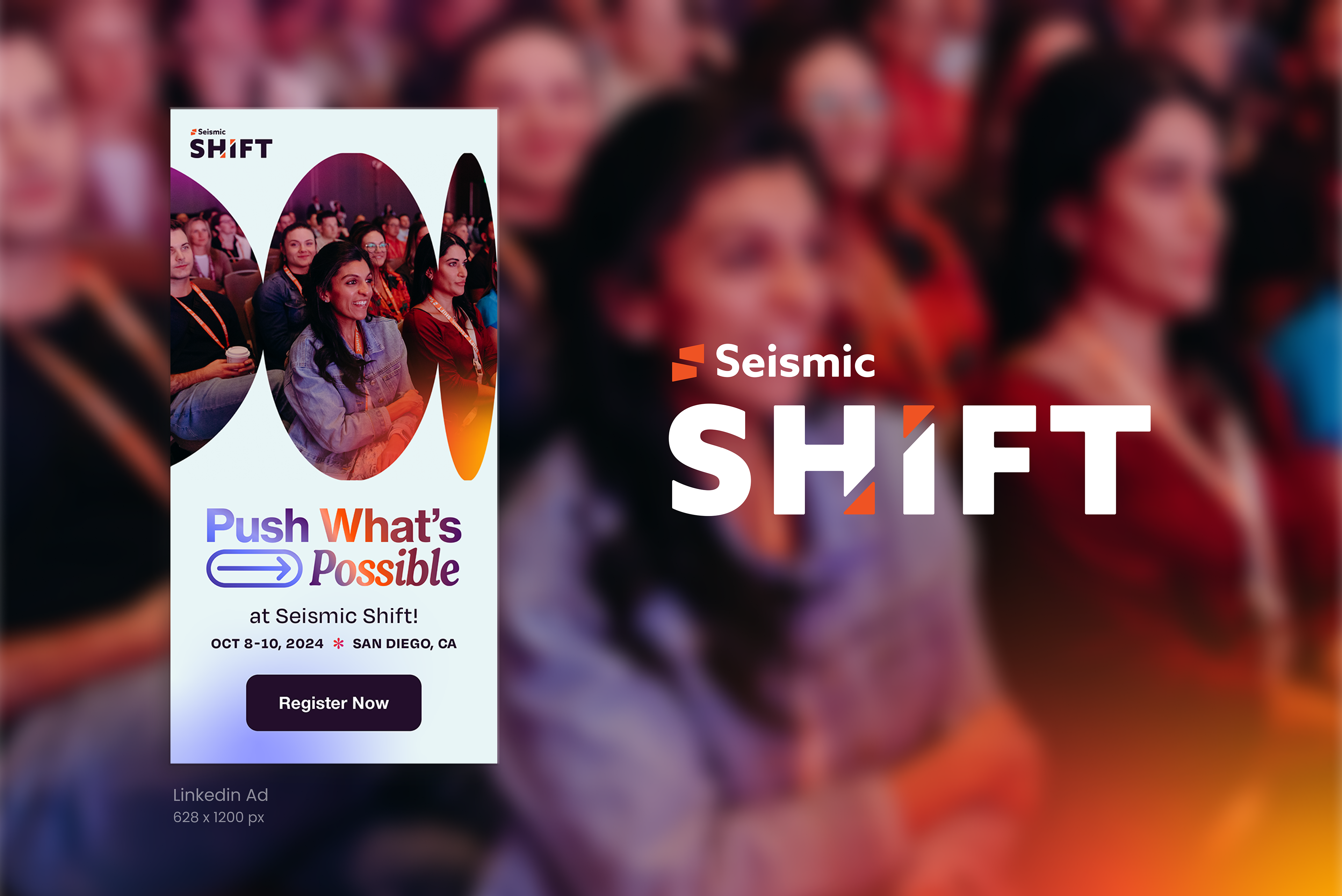
Shift24 Postcard
Shift, Seismic's annual user conference, brings together enablement leaders to 'push what’s possible' through keynotes, hands-on sessions, and networking opportunities.
In a 24-hour design challenge aimed at pre-event promotion, I developed a branded postcard concept to serve as a personal, tactile invitation, building anticipation for the event. Utilizing provided assets—including custom 3D shapes (Spline) —I refined initial concepts to solidify Shift's visual identity and branding guidelines. This project showcased my ability to work under tight deadlines, adapt to existing brand elements, and contribute to a cohesive and compelling promotional strategy.
Shift24 successfully attracted 1,000 attendees from 429 companies across 19 countries!
CREDITS
Art Direction - Jessica Sturgeon
Event Branding - Annie Garcia
Art Direction - Jessica Sturgeon
Event Branding - Annie Garcia
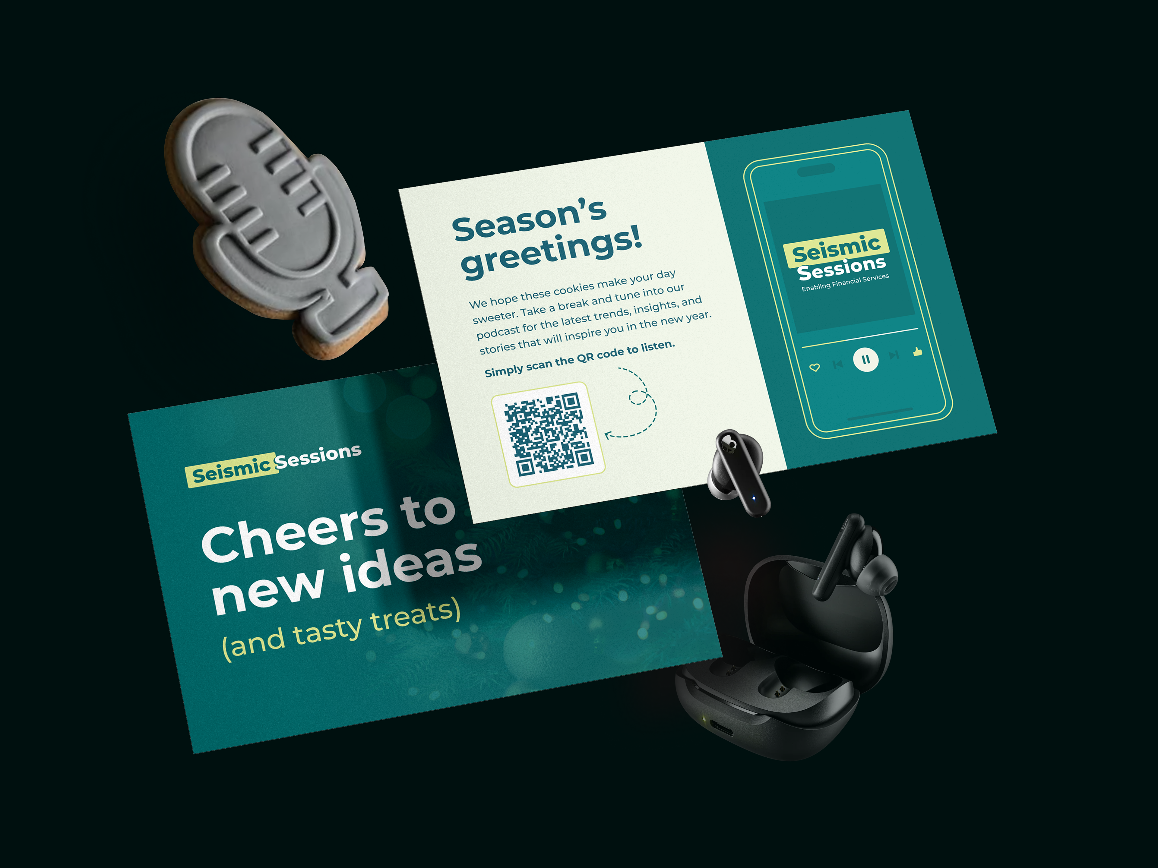
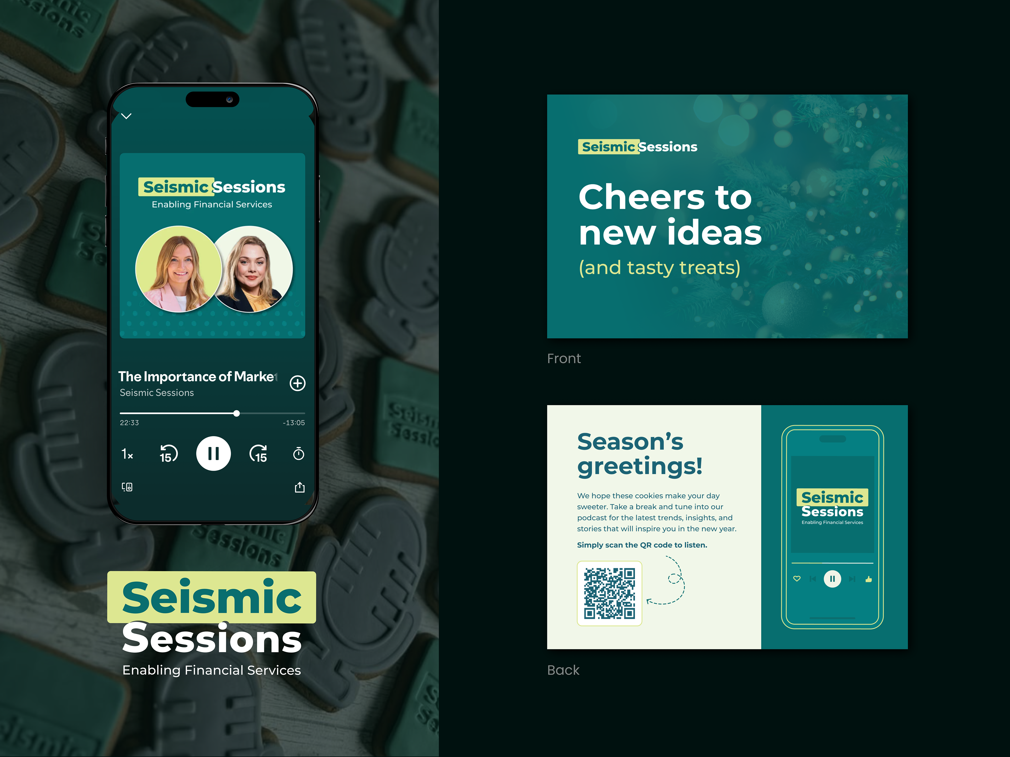
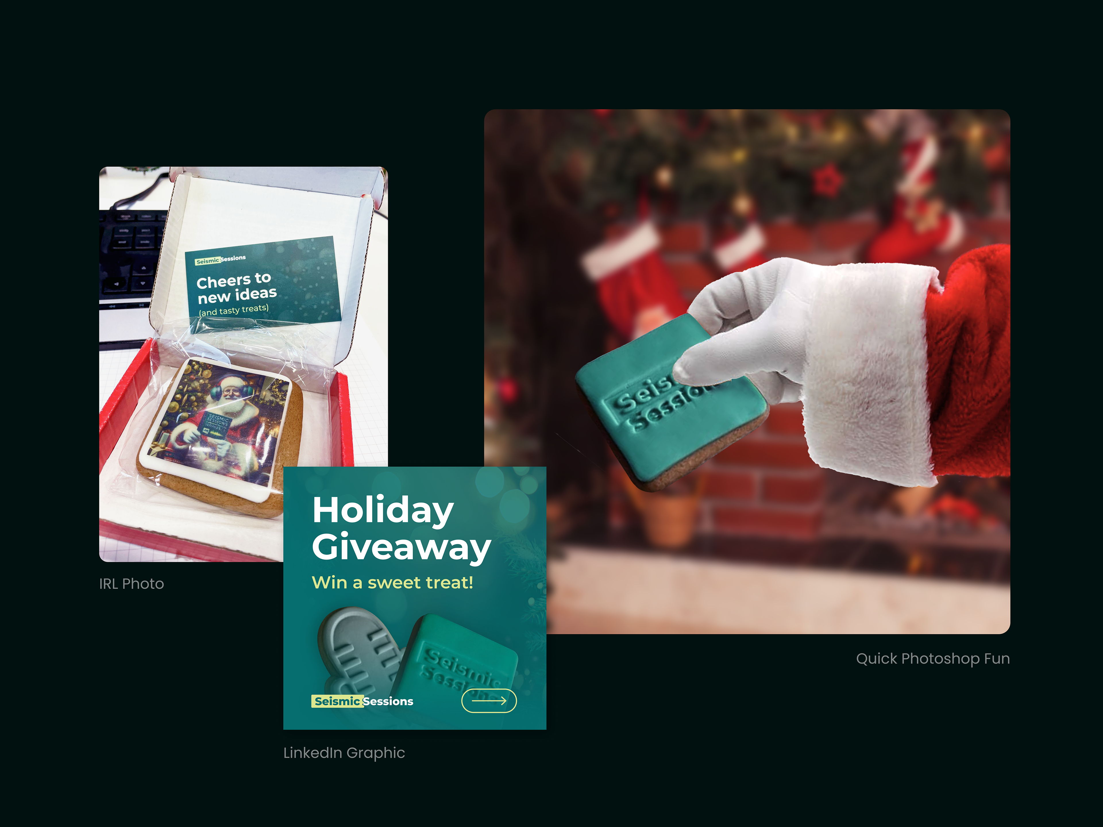
Seismic Sessions Postcard
Seismic Sessions is a sales enablement podcast featuring insights from industry leaders on strategies, trends, and tools that drive alignment, engagement, and growth.
As a thank you to our valued customers and an invitation for new leads, we paired premium gingerbread cookies with an invitation to explore Seismic Sessions, our podcast on sales enablement.
For this promotion, I created a postcard and LinkedIn graphic that reflected Seismic Sessions' branding, using the brand’s signature photography treatments, typefaces, and color palette. In an effort to remain inclusive of diverse holiday celebrations, warm bokeh lighting was chosen to evoke the feeling of winter lights, adding a festive yet universal vibe to the design.
CREDITS
Art Direction: Jessica Sturgeon | Previous Branding: Seismic
Copywriting: Allyson Fowler | Podcast Host: Gemma Livermore
Art Direction: Jessica Sturgeon | Previous Branding: Seismic
Copywriting: Allyson Fowler | Podcast Host: Gemma Livermore
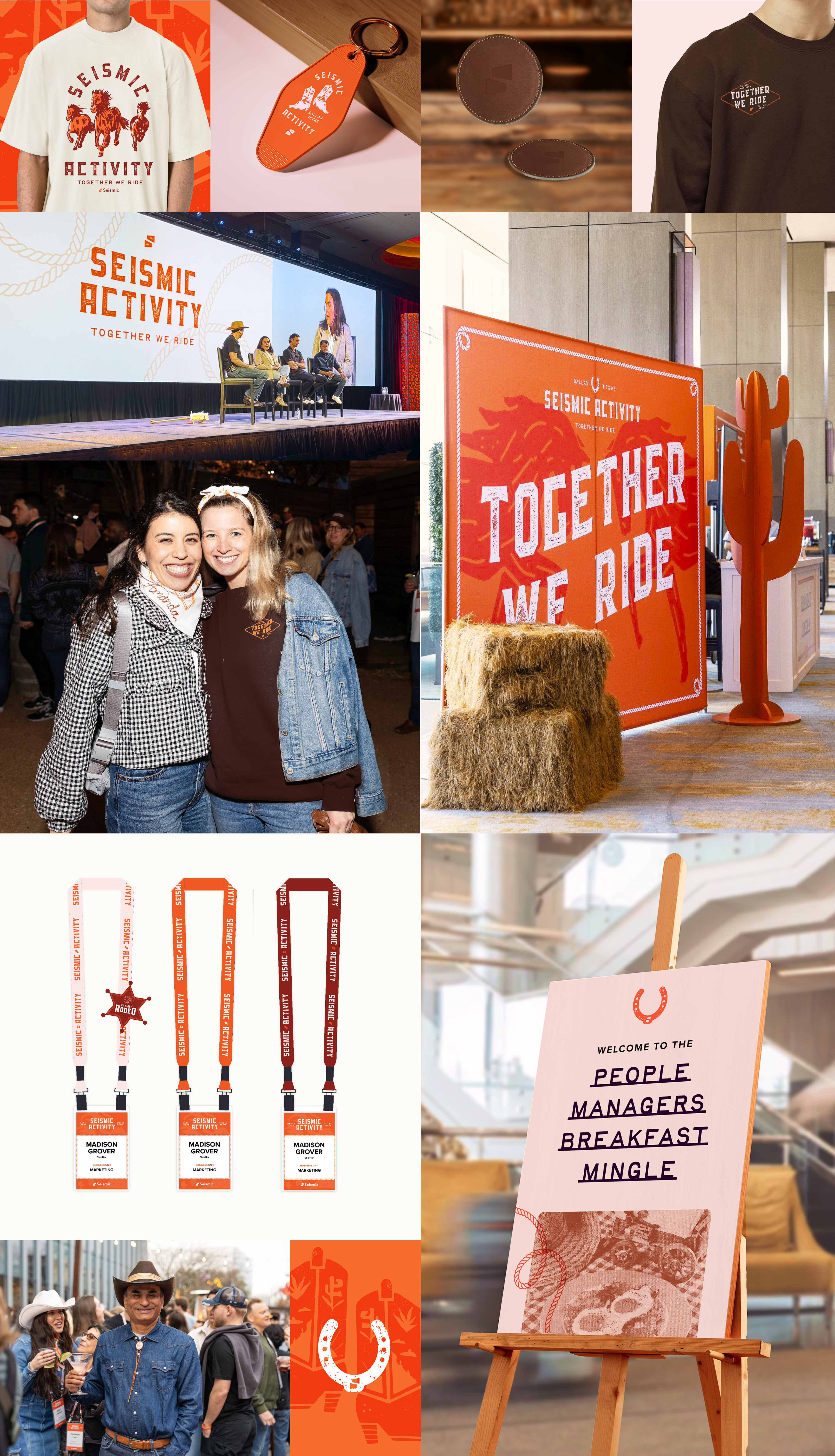
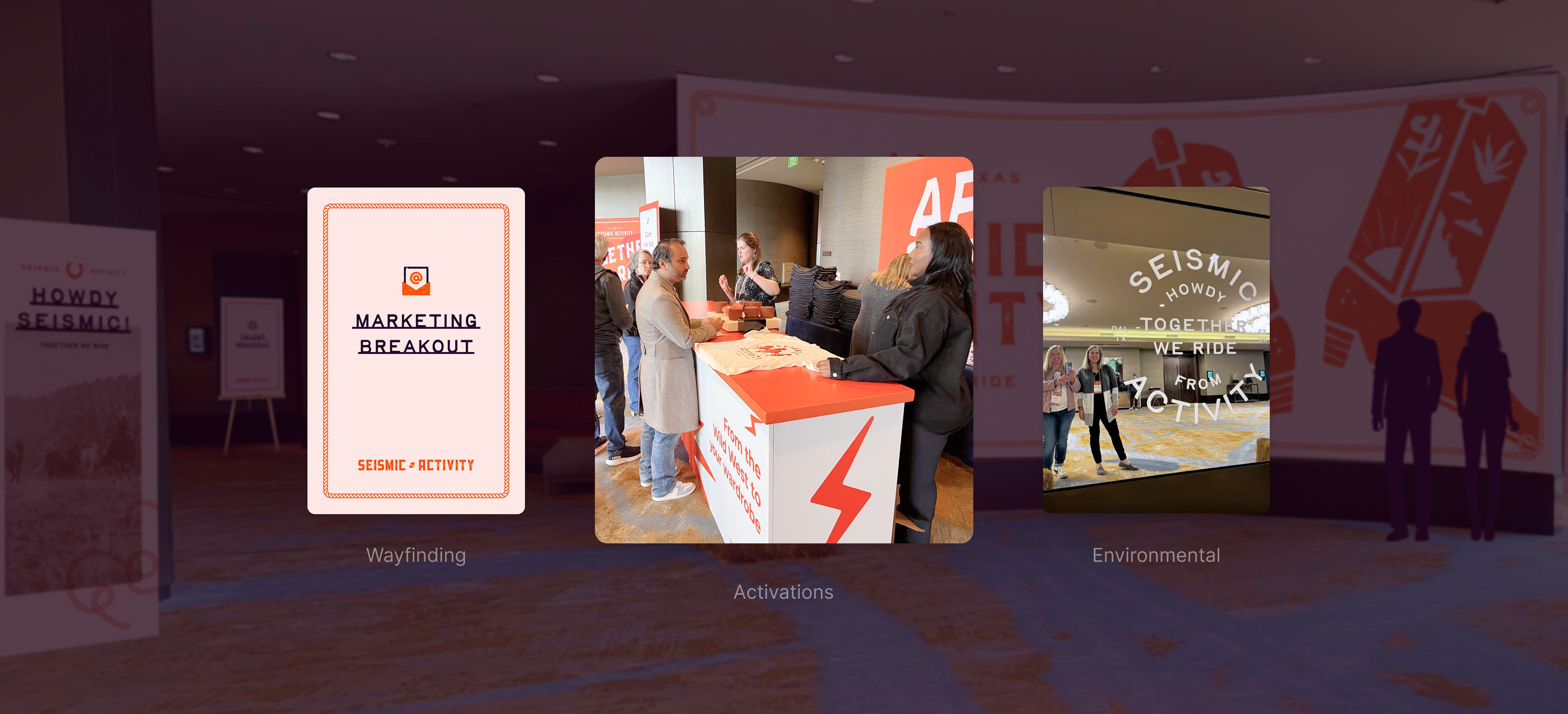
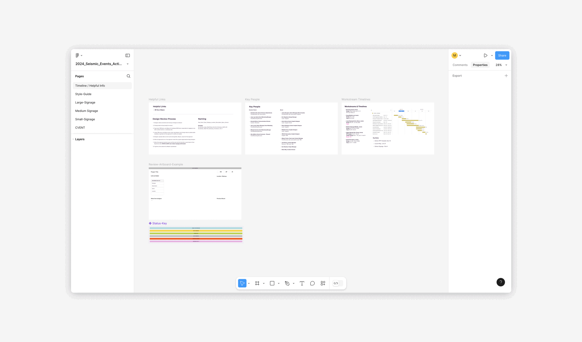
Seismic Activity 2025
Seismic Activity is Seismic's annual company-wide gathering designed to foster growth, collaboration, and celebration among employees. Working alongside the Events team, vendors, and stakeholders, I helped design cohesive touchpoints, ensuring consistency across all elements—from digital assets to physical experiences.
CREDITSEvent Branding: Annie Garcia
Art Direction: Jessica Sturgeon + Ethan May
Illustrations: Zac Sturgeon

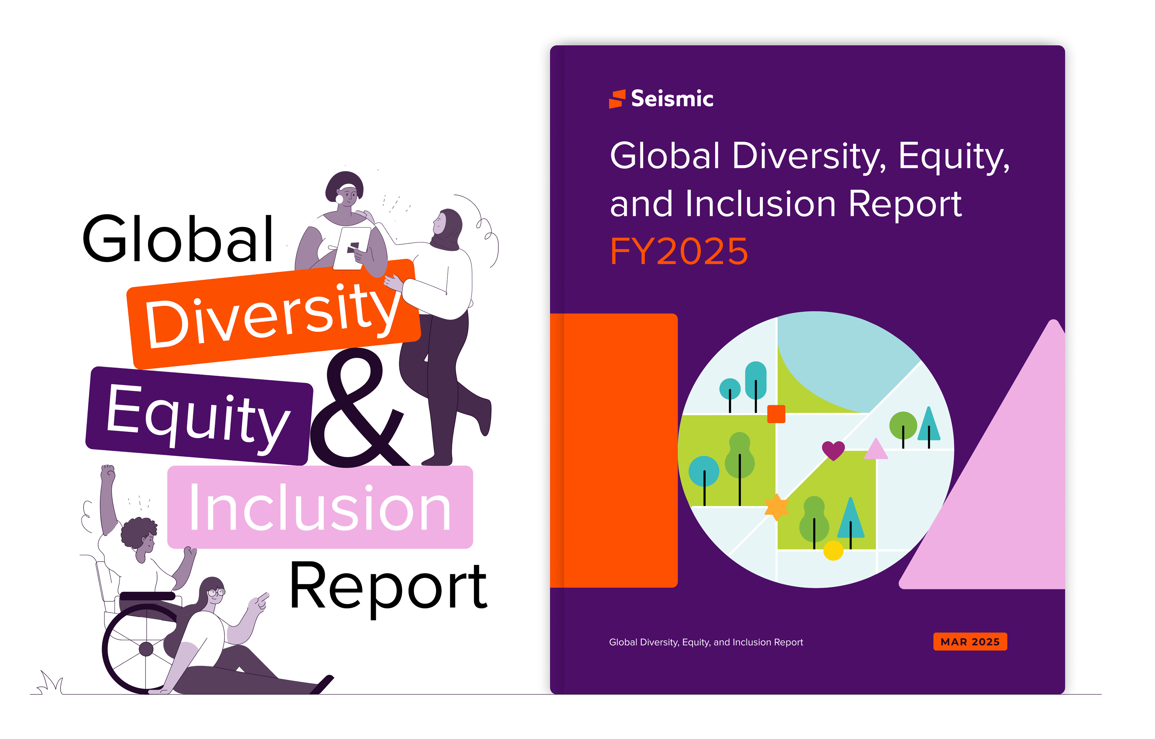
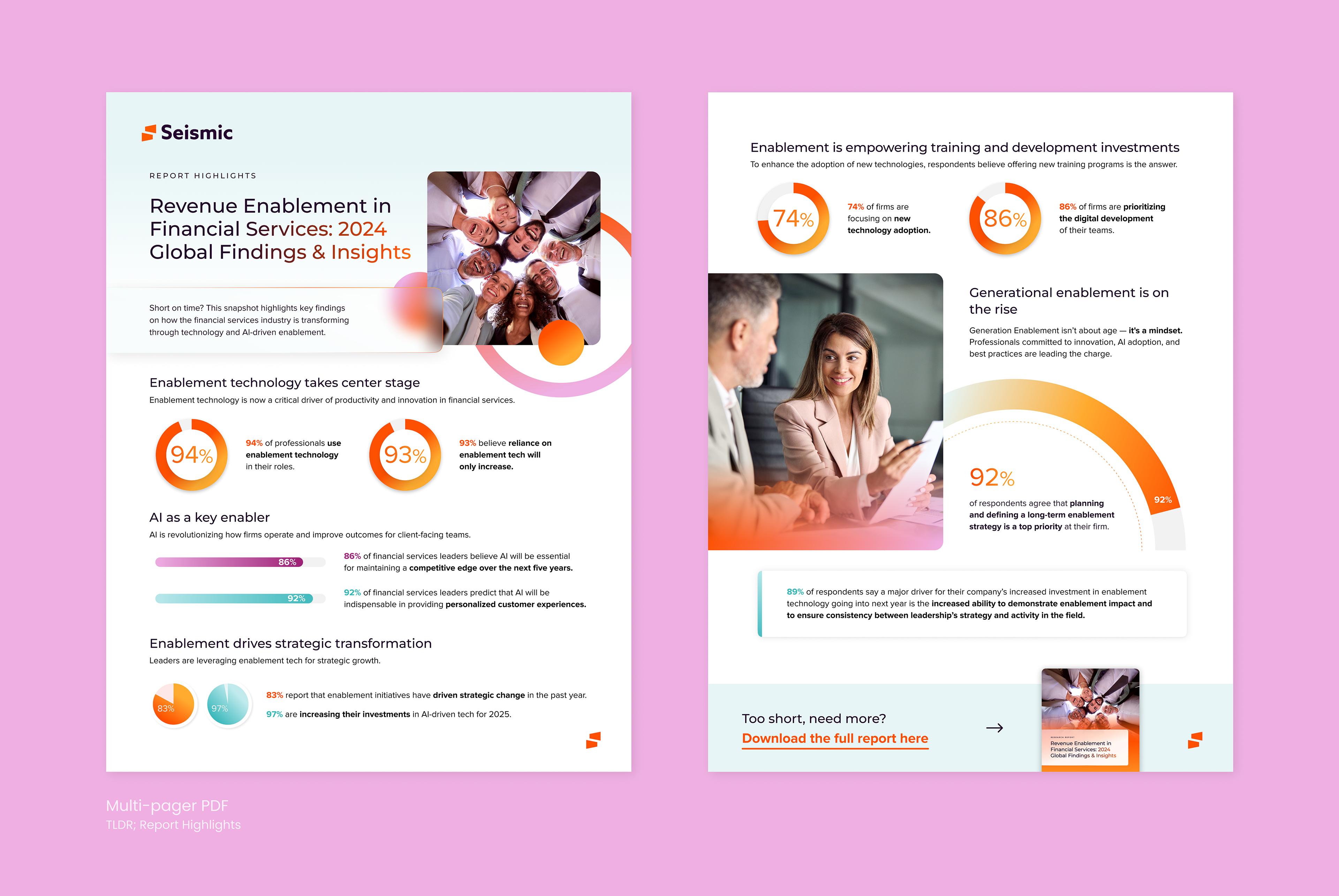
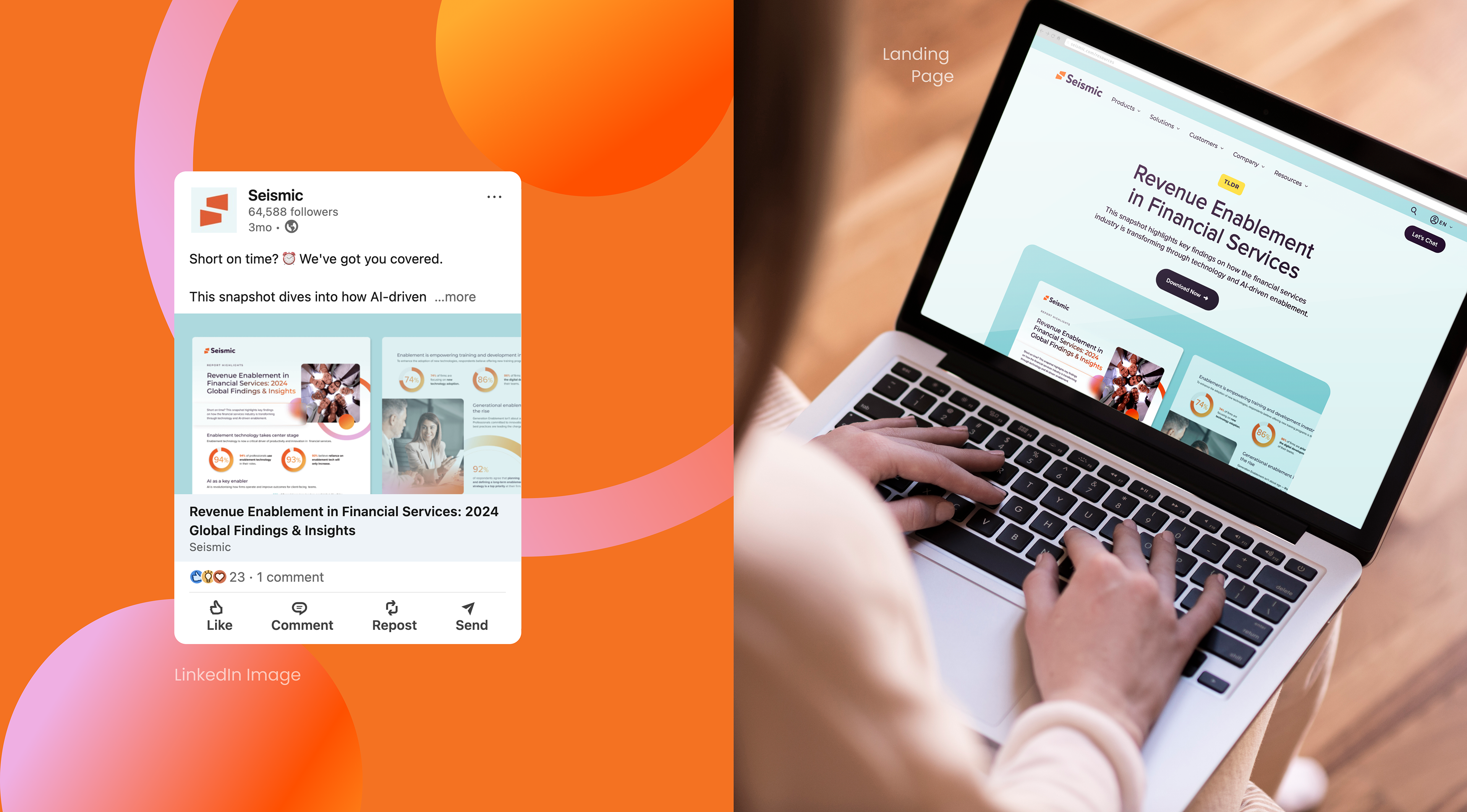
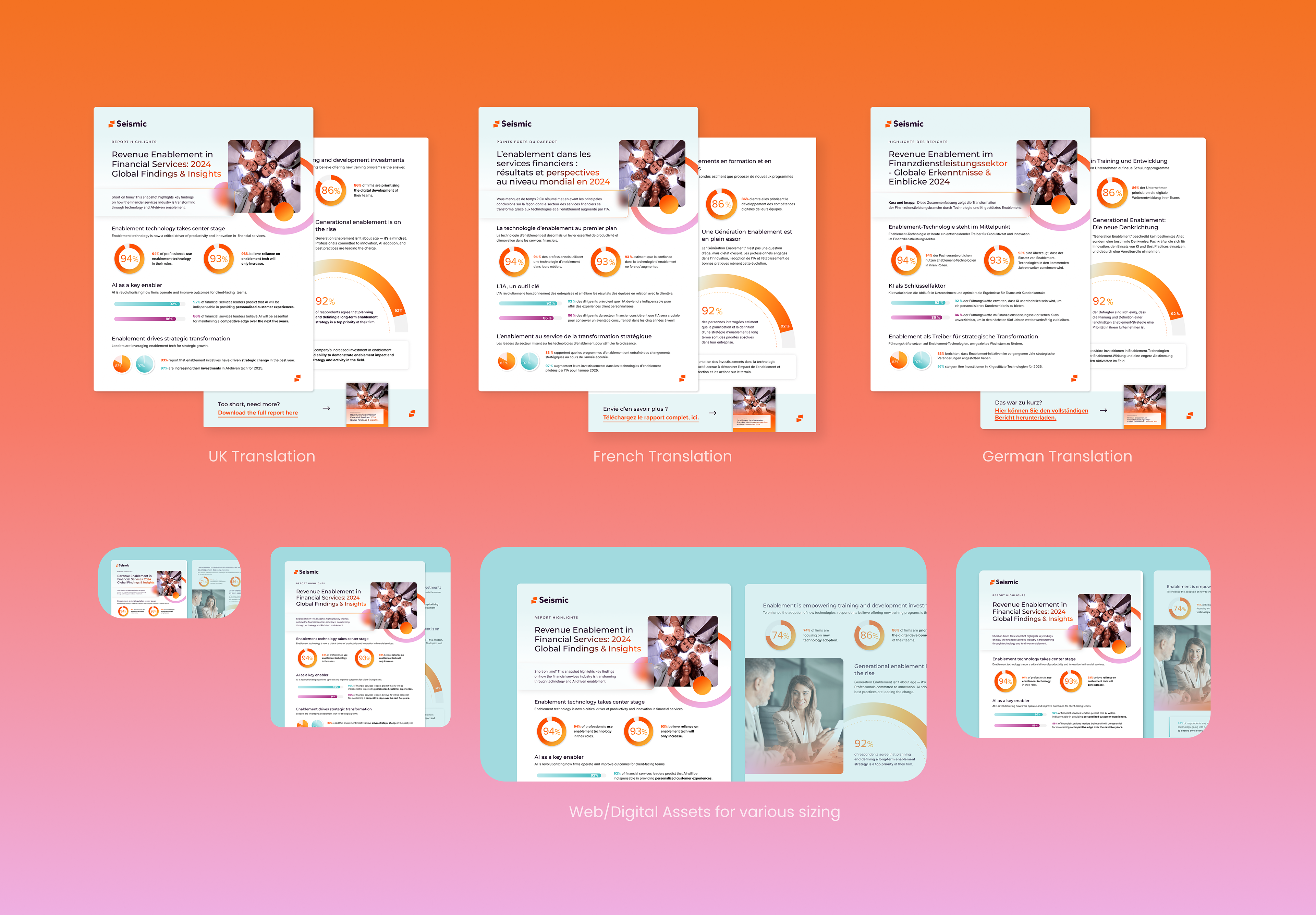
TLDR; Revenue Enablement Report
The Revenue Enablement in Financial Services: 2024 Global Findings & Insights report by Seismic explores how enablement technology, especially AI, is driving transformation and productivity in financial services. Based on insights from over 300 professionals, it highlights how industry leaders are embracing new technologies to stay ahead.
This TLDR version effectively delivers quick, digestible insights, allowing readers to grasp key points without reading the full report. Designed to mirror the larger report’s style, it incorporates systemized charts, graphs, and color treatments. The goal was to condense the information into as few pages as possible, while maintaining clarity and appropriate whitespace for easy reading.
CREDITS
Campaign Creative Lead: Eric Shepherd
Copywriting: Seismic
Campaign Creative Lead: Eric Shepherd
Copywriting: Seismic
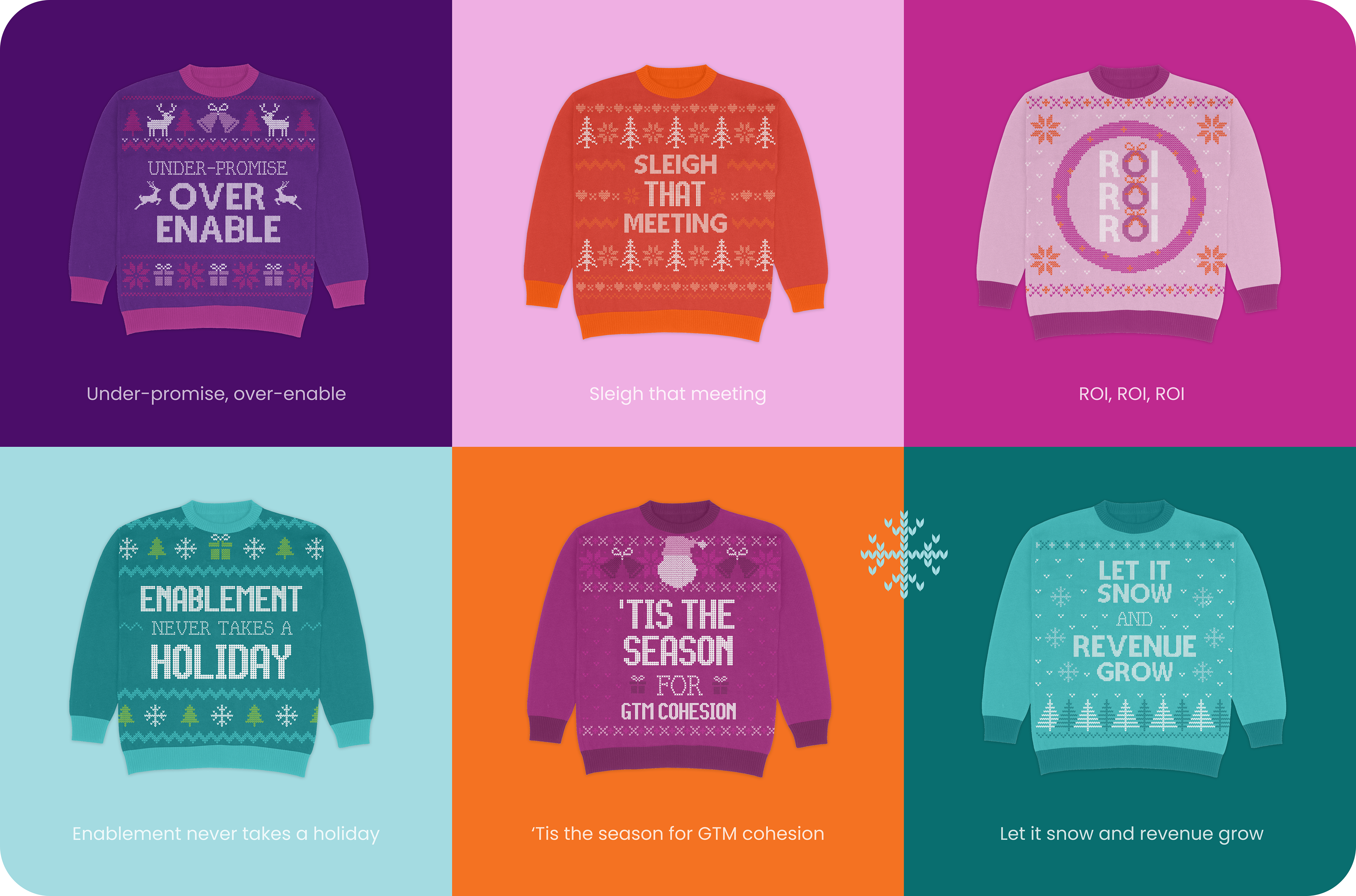
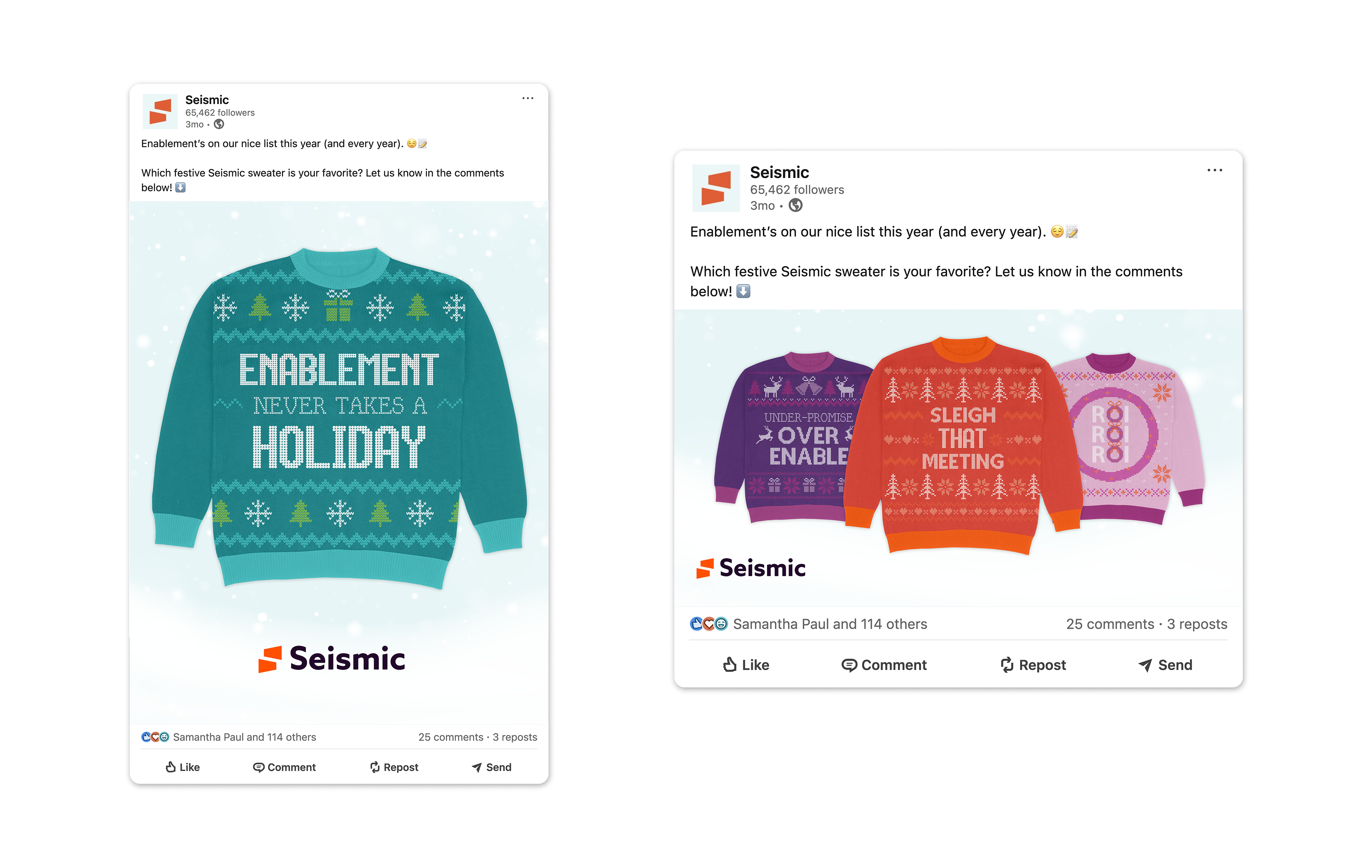
Ugly Holiday Sweaters
To bring a festive, lighthearted touch to Seismic’s social presence, I designed a set of six unique ugly holiday sweaters for our Social Media Manager. The goal? Boost engagement and showcase Seismic’s personality beyond software. Each sweater was requested to have its own distinct color-way and unique flair. I utilized Seismic's extended color palette to achieve a cohesive and playful look.
CREDITS
Social Media Management: Samantha Paul
Copywriting: John Rivers
Social Media Management: Samantha Paul
Copywriting: John Rivers
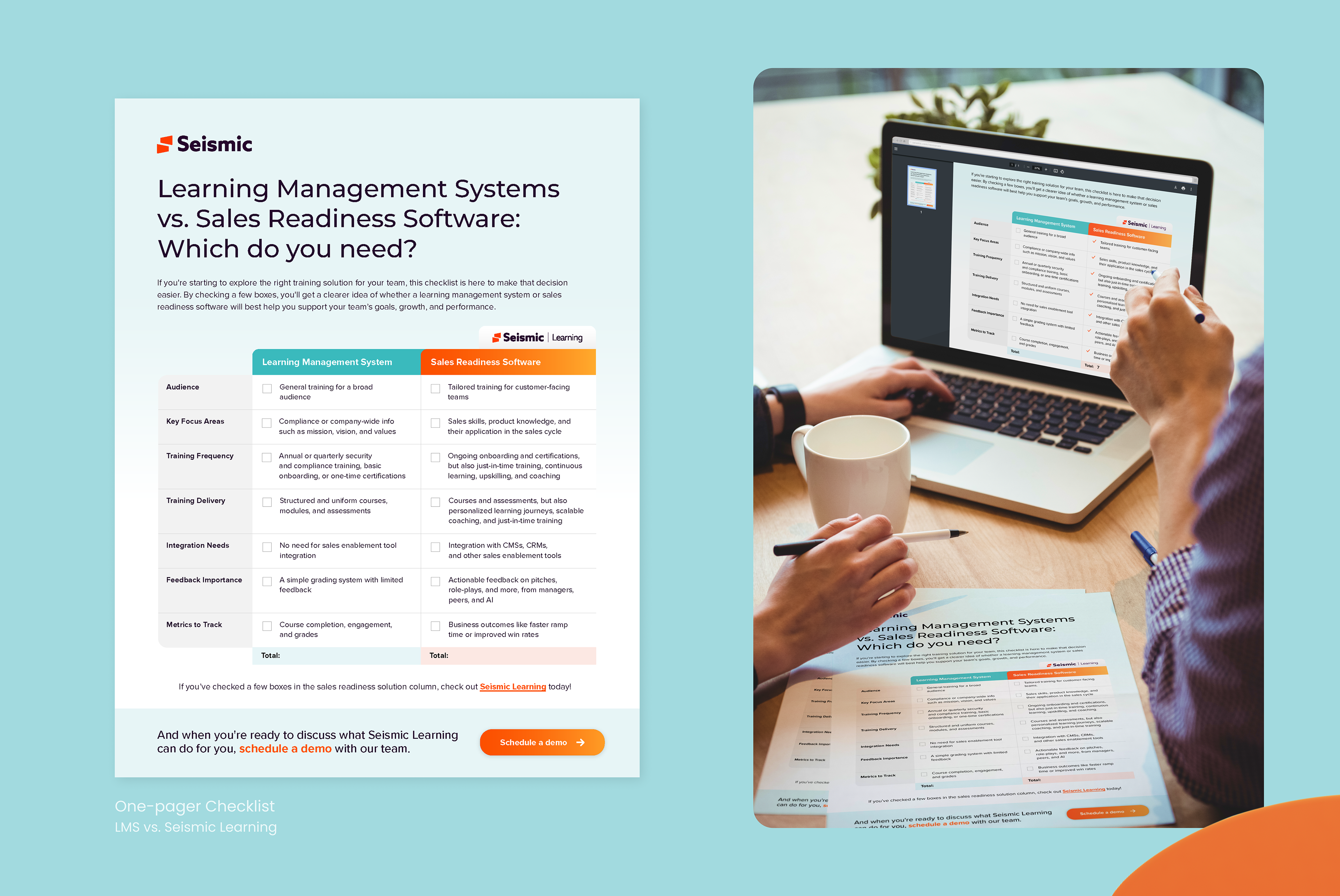
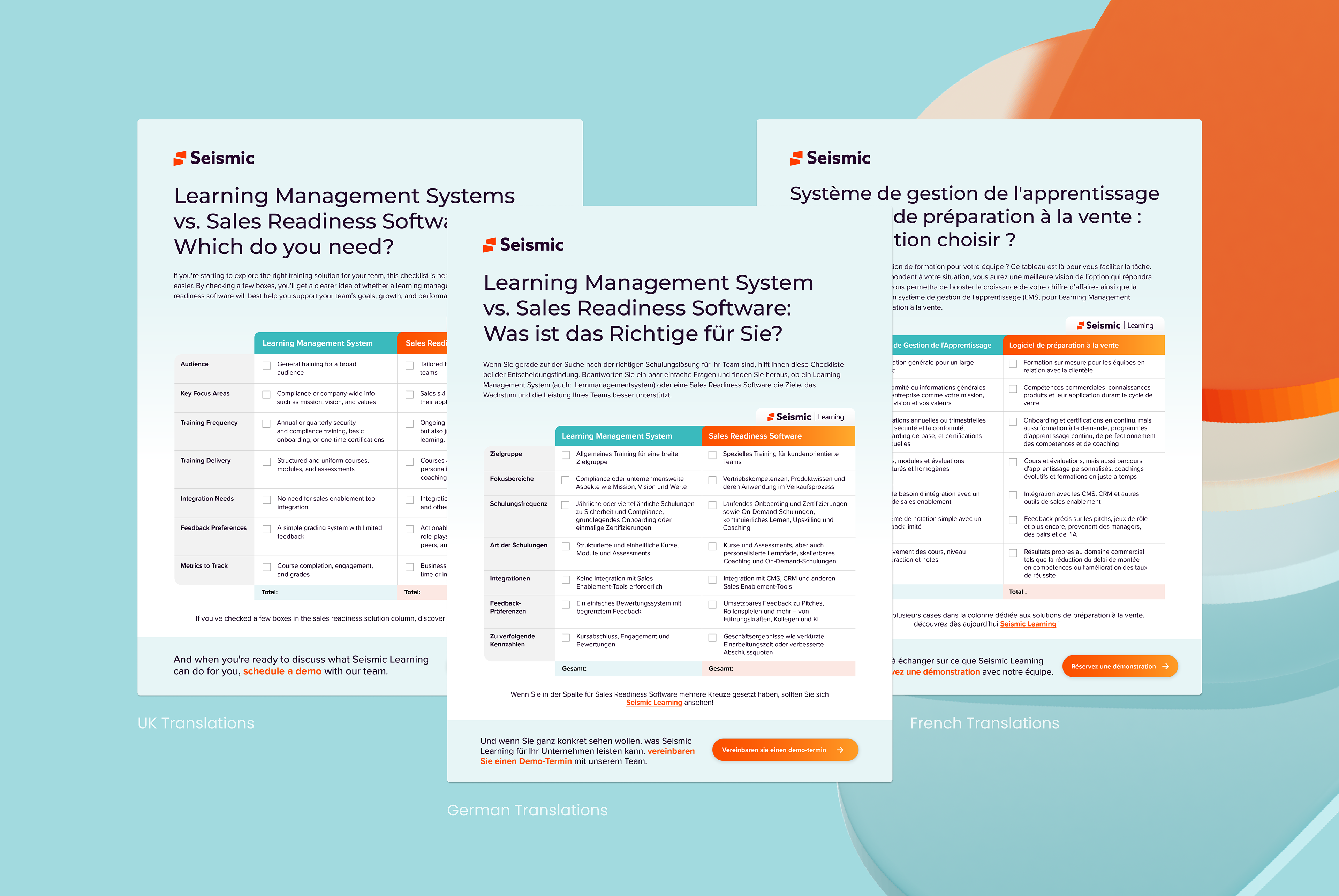
LMS vs. Seismic Meetings: Checklist
The objective was to create a concise, one-page checklist that clearly highlights the advantages of Seismic for Meetings over traditional software. This deliverable was designed to be form-ready, fully hyperlinked, and consistent with Seismic’s core branding, incorporating our cloud and dawn colors to ensure visual coherence.
As the designer, I prioritized clarity and simplicity, ensuring the content was easily digestible and the layout clean for quick, effective comparison. I also collaborated on revising the copy, streamlining it for optimal readability and best-use practices, ensuring the message was impactful and concise.
CREDITS
Copywriting: Seismic
Copywriting: Seismic
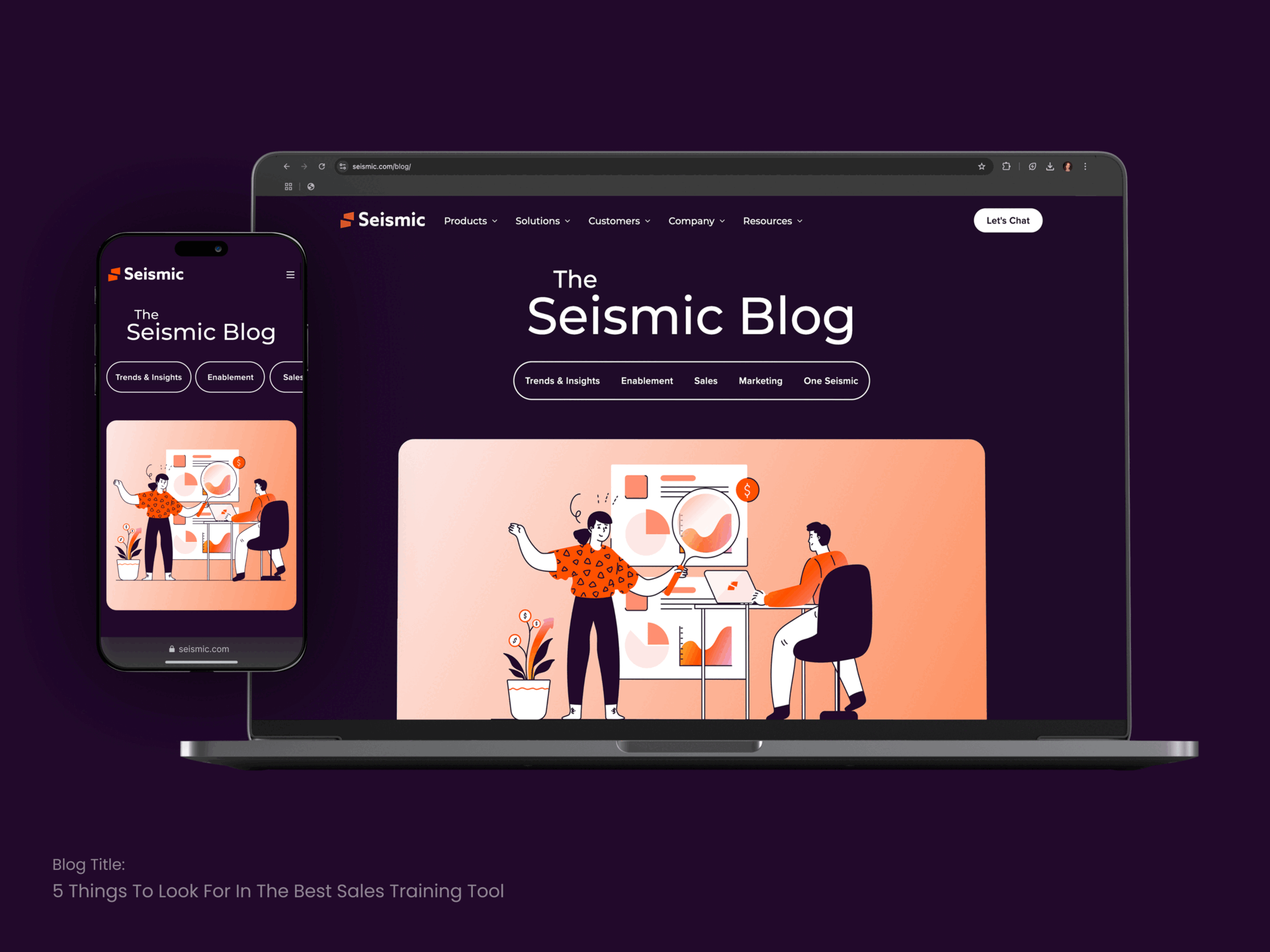
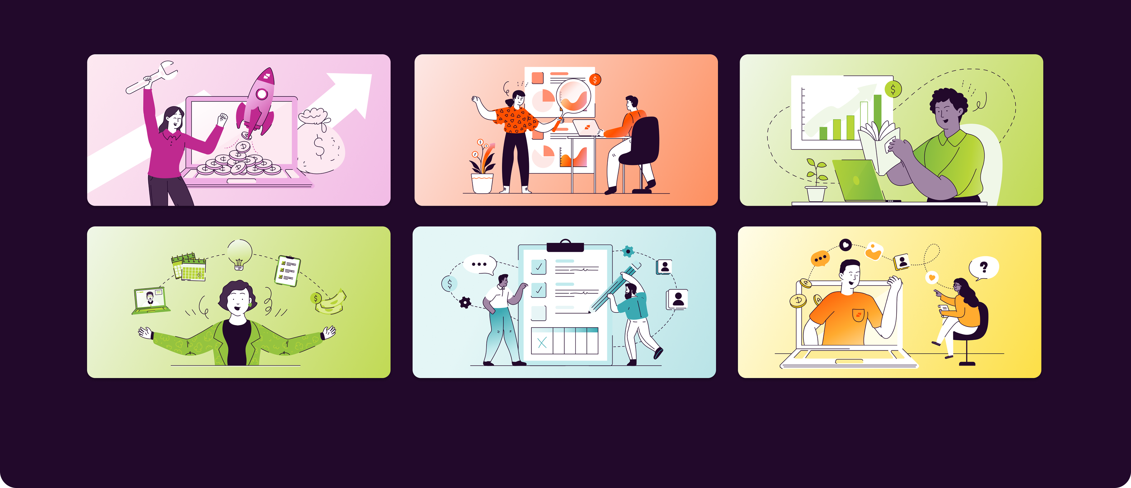
Seismic Blog Illustrations
Seismic leverages a custom illustration library to create blog graphics that visually represent complex topics. Since our product is digital and not easily captured by a single image, we start by identifying relevant keywords for SEO purposes. These keywords are then translated into scenes featuring illustrative humans, allowing for creative flexibility and better representation of abstract concepts.
Each blog graphic is color-coded and aligned with specific tags, ensuring consistency with the blog’s content and enhancing visual identity across the platform.
Each blog graphic is color-coded and aligned with specific tags, ensuring consistency with the blog’s content and enhancing visual identity across the platform.
CREDITS
Art Direction: Jessica Sturgeon
Original Illustration Library Build: Seismic
Art Direction: Jessica Sturgeon
Original Illustration Library Build: Seismic
Miscellaneous Illustration